
A packaging decision usually gets made the same way a logo decision does - five finalists go on a conference table or into a deck, the team debates, and somewhere in that debate the conversation stops being about which design actually works on a shelf and starts being about whoever has the most seniority in the room. That person's read isn't worthless. But they've spent a week staring at all five options under studio lighting with full context on the strategy behind each one, which is about as far as you can get from a shopper glancing down an aisle for two seconds, in low-information, auto-pilot mode, deciding where to let their eyes land.
Packaging carries an extra wrinkle logos mostly don't: it isn't just "which do you prefer," it's "which one actually gets noticed in the first place." A design can be everyone's favorite in a quiet room and still lose on a real shelf, buried next to a dozen competitors, if nothing about it pulls a glance. Preference and attention are genuinely different questions, and testing for one doesn't automatically answer the other - which is exactly why packaging testing benefits from more than a single method. This guide covers three tools that each answer a different part of the question - which stands out, which wins head-to-head, and why - and how to combine them into one testing pass instead of guessing which single method covers everything.
If you only know packaging testing as "put it in front of some people and ask what they think," it's worth knowing the field has more established names for the pieces this guide covers: a shelf test (sometimes called a standout test or attention test) measures which design catches the eye first in a competitive set, a forced-choice or head-to-head test (the same mechanic behind pairwise comparison) measures preference once attention isn't the question, and a diagnostic pass digs into which specific elements - color blocking, claim legibility, logo placement - are actually doing the work once you know which design is winning. Whichever names you've heard them under, they're the three methods this guide walks through.
Table of Contents
- Why "Which Do You Like" Isn't the Whole Question
- Three Tools, Three Different Questions
- Step-by-Step: Building a Shelf Standout Test
- Step-by-Step: Following Up With a Preference Tournament
- Diagnosing the Winner with a Stimulus Section
- Best Practices for Framing Packaging Options Fairly
- Reading Your Results
- Illustrative Walkthrough: Four Concepts, One Shelf
- FAQ
Why "Which Do You Like" Isn't the Whole Question
Ask a room - internal or external - to rate four packaging concepts on a 1-to-5 "how much do you like this" scale, and you'll run into the same compression problem that shows up in logo testing: most ratings cluster in the middle, the gap between your strongest and weakest concept shrinks down toward noise, and "which one do people actually like" ends up a close enough call that the decision quietly reverts back to whoever's opinion carries the most weight in the room.
Packaging has a second problem layered on top of that one, and it's the one a plain preference rating never catches at all: a design people say they like in a survey isn't automatically a design that gets noticed on an actual shelf. Respondents answering a "rate this concept" question are looking at one image at a time, full attention, no competition, no time pressure - nothing like the two-second, half-attentive glance a real shopper gives a shelf full of competing products. A quiet, tasteful design can score well on preference and still disappear completely next to four louder competitors it will actually sit beside in a store. Testing preference alone answers "do people like it once they're already looking at it" - a real and useful question, but not the same as "does it ever get looked at in the first place."
A few specific failure patterns show up constantly in informal packaging reviews:
- Everyone has an opinion, and internal taste runs ahead of the market's. The people in the room have usually seen every concept a dozen times across multiple rounds of revisions - which makes "fresh eyes" a genuinely scarce resource internally, and makes external, first-glance reaction worth more than another round of internal debate.
- Rating scales hide exactly the gap that matters. Independent 1-5 ratings compress differences toward the middle - the same mechanism covered in more depth in our logo testing guide, which runs into an identical problem for a different kind of design decision.
- "Which one do you like" and "which one did you notice" are different questions, and answering one doesn't answer the other. A design can win a preference vote and still be the one shoppers' eyes slide right past on a real shelf - the two questions need two different kinds of test, not one blended score that quietly conflates them.
- Familiarity bias runs stronger here than almost anywhere else in design testing. Whoever briefed the agency, approved three rounds of revisions, and has opinions about the client's brand history is the single worst-positioned person in the building to judge a stranger's two-second first reaction - not because their taste is bad, but because they can no longer see the concept the way someone encountering it cold actually will.
Three Tools, Three Different Questions
Three Opionate section types answer three genuinely different parts of a packaging decision, and the right move is usually to combine them rather than pick just one:
A Shelf Test answers "which one gets noticed first." Respondents see your whole pool of packaging concepts at once, arranged like products on a shelf, in a random order generated fresh for each respondent - and simply tap whichever ones catch their eye. There's no rating scale and no forced ranking, just an unprompted attention read. Randomizing each respondent's layout is the detail that makes this a valid attention measure rather than a popularity contest: a design shown first "almost always receives attention" regardless of its own merits, so a fixed layout would confound "which design stands out" with "which design happened to be shown first." See Introduction to Shelf Test for the full mechanics.
A Pairwise Comparison answers "which one wins, head-to-head, once attention isn't the variable." The same forced-choice tournament mechanic covered in our logo testing guide and ad creative testing guide - two concepts shown side by side, no "neither" option, winner advances - works the same way for packaging. It's the right tool once you've narrowed a field, or when attention isn't the open question and you specifically want a clean preference ranking. See Pairwise Comparison Testing: Setting Up a Head-to-Head Tournament.
A Stimulus Section answers "why." Neither a Shelf Test nor a Pairwise tournament tells you which specific element - the color block, the claim on front-of-pack, the logo size - is actually driving the result. A Stimulus Section lets you upload a single concept, draw highlight regions around its individual elements, and ask a targeted question about each one once you know which concept deserves that closer look. See Setting Up Image and Video Stimulus Testing.
Used together, the sequence is usually: Shelf Test to find what gets noticed, Pairwise to confirm (or challenge) that with a clean preference read, Stimulus to diagnose why the winner is winning before you commit to a final production run.
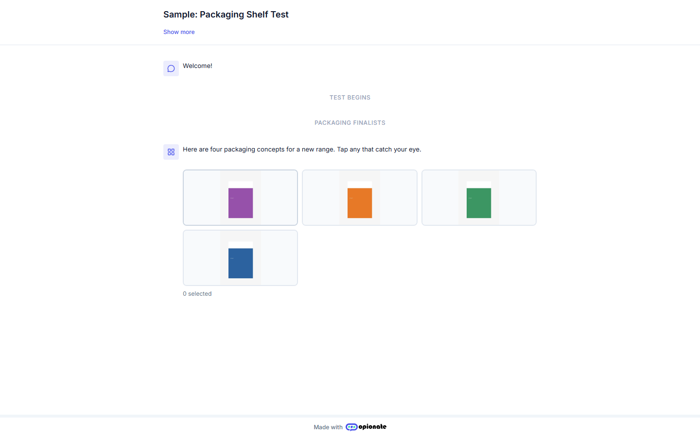
A respondent's view: the whole pool at once, in a layout randomized fresh for each person. Shown concepts are sample content.
Step-by-Step: Building a Shelf Standout Test
1. Prepare consistent renders. Same size, same angle, same lighting or background - for exactly the same reason this matters in logo testing. An inconsistent render reads as a quality signal and biases attention toward whichever concept simply looks most "finished," not whichever one would actually stand out on a real shelf.
2. Create an Advanced Survey and add a Shelf Test section. The section supports a pool of 2 to 8 images - kept deliberately smaller than Pairwise's 12-item cap, since more than about eight gets visually noisy for a respondent trying to take in a whole "shelf" at a glance, which defeats the point of a quick attention read.
3. Upload your packaging concepts. Each one can carry an optional label, visible to you in the builder and in your results, but hidden from respondents by default - deliberately, since the feature's whole premise is an unprompted, purely visual reaction. A visible caption would turn "which one catches your eye" into "which caption do you like." If you're specifically testing named flavors or price points where the label itself is part of what you're evaluating, a Show Labels to Respondents toggle lets you opt in.
4. Set how many concepts a respondent can select. This isn't a separate Shelf Test setting - it's the same min/max selections control available on any multi-select question. Set a max of 1 for the strictest "first-glance" read, or allow 2-3 if you want to know a shopper's full initial scan, not just their single strongest pull.
5. Write your intro message plainly. Something like: "Here are four packaging concepts for a new range. Tap any that catch your eye." No further instruction needed - the whole point is an unprompted reaction, not a considered evaluation.
6. Preview, publish, and share the link with your team, your customers, or an external panel, exactly as you would any Opionate survey.
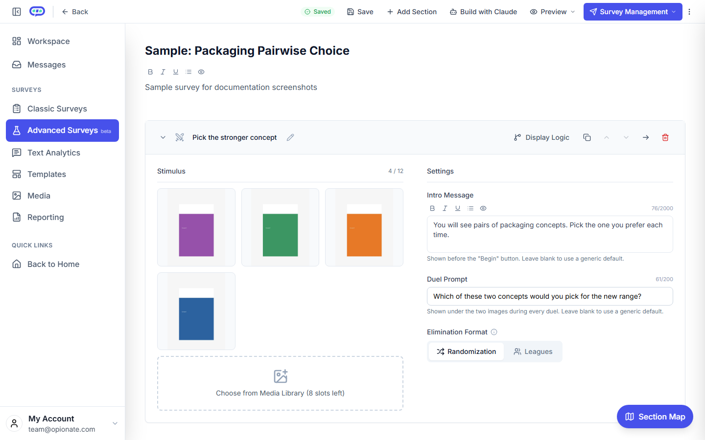
The builder: your packaging finalists, loaded as the comparison pool for a head-to-head round.
Step-by-Step: Following Up With a Preference Tournament
Once you know which concepts actually get noticed, add a second section - a Pairwise Comparison - to answer the preference question cleanly. Building one works exactly as covered in the logo testing guide's step-by-step: upload your finalists (narrowed from the full field, not the whole original pool - there's little point running a full tournament on a concept that already lost the attention test badly), choose Randomization for an unrelated set of concepts or Leagues if your finalists are color or format variants of the same underlying design, and write a duel prompt specific to your actual decision - "Which of these would make you pick up the product?" produces a sharper signal than a generic "which do you prefer."
Running the Shelf Test and the Pairwise tournament as two sections in the same survey, rather than two separate surveys, means the same respondent pool answers both questions, and you can directly compare "did the concept that got noticed first also win the preference vote" - which is itself a genuinely useful finding, not just a methodological convenience.
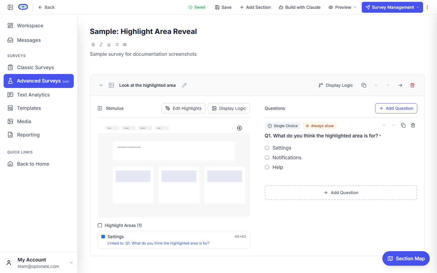
A Stimulus Section's builder: highlight regions linked to targeted questions, the same mechanism used here to dissect a winning concept element by element.
Diagnosing the Winner with a Stimulus Section
A Shelf Test tells you which concept won attention. A Pairwise tournament tells you which concept wins on preference. Neither tells you why - and "why" is what you actually need before committing a winning design to a full production run across every SKU in a range. Once you have a clear winner (or a close top two worth comparing directly), add a Stimulus Section for each finalist: upload it, draw highlight regions around its distinct elements - the color block, the front-of-pack claim, the logo lockup, the product photography if there is any - and ask a targeted question under each one. Does the claim read clearly at a glance? Does the color feel right for the category? Is the brand mark legible at the size it'll actually appear on a physical shelf, not just at full-screen zoom in a survey?
Because Stimulus Section questions are ordinary questions in your survey's normal question list, they support the same conditional Display Logic available anywhere else in Opionate - show a follow-up open-ended question only to respondents who rated a specific element poorly, rather than padding the survey with an extra question for everyone regardless of whether they had a complaint worth explaining. That's the same "diagnose only where there's something to diagnose" pattern covered in more depth in our Design Feedback Surveys guide to the Stimulus Section.
Best Practices for Framing Packaging Options Fairly
- Identical presentation for every concept, in both the Shelf Test and the Pairwise round. Same size, same background, same lighting. Any inconsistency biases both attention and preference toward whichever render simply looks most polished, independent of the actual design underneath it.
- Show the concept at a size and angle close to how it'll actually be seen. A hero render at full-screen zoom can read very differently from the same design shrunk down to shelf scale - if small-size legibility is part of the decision, say so in a diagnostic question rather than assuming a large, detailed render tells you everything.
- Don't mix genuinely different product formats in one pool (a bottle alongside a box alongside a pouch) unless format itself is specifically what you're deciding between - otherwise a shelf standout result may just be measuring which shape is novel in the set, not which packaging design is strongest.
- Match your respondent pool to your actual target shopper. A premium specialty-food shelf and a mass-market grocery shelf reward genuinely different things, and a mismatched panel will hand you a confident, wrong answer.
- Keep internal stakeholders out of the same respondent pool as your real audience if you want a clean external read. Run an internal round separately if you want to compare the two - mixing them makes it impossible to tell afterward whether internal familiarity quietly tipped either result.
Reading Your Results
Both sections' results sit in your survey's Report tab alongside the rest of your data, the same place every other question's results live - no separate dashboard or export format to learn. The Shelf Test's result renders as an image gallery with each concept's pick rate, plus an optional stat on how early in a respondent's tap sequence a concept was typically chosen - useful signal for "this one eventually got picked, but only after a slower look," distinct from an instant, confident pull. The Pairwise tournament's result is the same ranked gallery-plus-bar-chart format covered in the Pairwise results guide, and every individual Stimulus Section question behaves exactly like any other question's results in your report.
If the Shelf Test winner and the Pairwise winner disagree, that's not a contradiction to resolve away - it's a genuinely useful finding. A concept that wins attention but loses preference is pulling eyes without earning the pick once someone looks closer; a concept that wins preference without winning attention risks never getting that closer look in the first place on a real, crowded shelf.
Illustrative Walkthrough: Four Concepts, One Shelf
Picture a small food brand choosing packaging for a new product line, down to four finalist designs from an agency, with a production deadline in three weeks.
They build an Advanced Survey with a Shelf Test section first, uploading all four concepts at identical size and lighting, with Max Selections set to 2 so respondents can indicate both an instant pull and a close second look. The intro message reads plainly: "Here are four packaging concepts for a new range. Tap any that catch your eye." The link goes to a mix of existing customers and an external panel matched to the product's target shopper.
The Shelf Test results come back with one concept clearly ahead on pick rate - a bolder color block than the team had been leaning toward internally, where the quieter, more "premium-feeling" direction had been the internal favorite through two rounds of revisions. Rather than override the data on gut feel, the team adds a Pairwise Comparison section with just the top two concepts, phrased around their actual decision - "Which of these would make you stop and pick up the product?" - and the bolder concept wins there too, confirming the attention result wasn't just noise.
Before finalizing, they add a Stimulus Section on the winning concept alone, highlighting the color block, the front-of-pack claim, and the logo placement separately. The color block and claim both read clearly; the logo, highlighted and asked about on its own, scores noticeably weaker on a dedicated "is this easy to read at a glance" question - a fix the team can make in final production without re-opening the color decision that had already been validated twice.
FAQ
Do I need all three sections, or can I just run one?
A Shelf Test alone is enough if attention is the only open question - you already know preference, or it isn't the decision you're making. Add Pairwise when you specifically need a clean preference ranking, and Stimulus Section once you need to know why a concept is winning, not just that it is. Running all three in sequence is the most complete read, not a requirement for every test.
How many packaging concepts can a Shelf Test pool hold?
2 to 8 images. If you're starting from a larger field, consider an earlier internal screening round to narrow down before testing with real respondents - see the ad creative testing guide's screening stage for a version of this same pattern applied to a different kind of concept.
Should I show labels or flavor names on the packaging concepts?
Off by default, for good reason - the feature's premise is an unprompted visual reaction, and a visible caption risks measuring caption preference instead of design standout. Turn on Show Labels to Respondents only when the label itself is genuinely part of what you're testing, such as comparing named flavor variants.
What if the Shelf Test winner and the Pairwise winner don't agree?
That's a real, useful finding, not an error to resolve - it tells you a concept is either pulling attention without earning preference, or earning preference without reliably getting noticed first. Which one matters more depends on your specific shelf context and how much competing visual noise the product will actually sit next to.
Is this the same method used for logo or ad creative testing?
Pairwise Comparison and Stimulus Section work identically across all three use cases - see our logo testing guide and ad creative testing guide. Shelf Test is specific to this guide's use case: measuring standout within a set shown all at once, which doesn't come up the same way for a single logo or a single ad creative shown on its own.
Let the Shelf Decide
A quiet room full of internal opinions can tell you what the team prefers. It can't tell you what a shopper's eyes will actually do on a crowded shelf. A Shelf Test answers that question directly, a Pairwise tournament confirms the preference read, and a Stimulus Section tells you exactly why the winner is winning before you commit to a full production run.
Start an Advanced Survey on Opionate and upload your packaging concepts - standout, preference, and diagnosis all run in the same tool.