
Logo decisions get made in a strange way for something so consequential. Five directions go into a deck, the team debates for an hour, and somewhere in that hour the conversation stops being about the logo and starts being about whoever's opinion carries the most weight in the room - the founder, the creative director, the client who's paying the invoice. That person usually isn't wrong to have a strong opinion about their own brand. But they're one person, sitting close to the strategy behind every direction, deeply familiar with all five options after staring at them for a week - which makes them about as far as you can get from a representative sample of the customers, users, and strangers who'll actually encounter this mark on a storefront, an app icon, or a business card for the next several years without any of that context.
The natural next move is to widen the circle - "let's just ask a few people" - and that instinct is right, but it usually runs straight into the same problem independent rating scales always have. Show someone five logos and ask them to rate each one from one to five, and the ratings cluster in the middle almost every time. Whatever internal reference point a respondent uses for "3" versus "4" doesn't stay fixed across five separate judgments made in the space of a minute, and by the third or fourth logo they're rating faster and paying less attention than they were on the first. You end up with five numbers that are close enough to each other that declaring a real winner starts to feel like a coin flip dressed up as data.
What actually separates preferences cleanly is a forced choice: show two logos side by side, ask which one, repeat with a new pair. There's no scale to misjudge and no room for the polite indecision that lets someone rate two options identically even when they'd pick one instantly if you made them choose. This guide covers how to run that as an actual structured tournament - not just one round of head-to-head picks, but a full knockout across every direction you're considering - using Opionate's Pairwise Comparison section, and how to follow it up with targeted, element-by-element feedback on your finalists before you commit a winning mark to years of production use.
If the term "pairwise comparison" is new to you, it's worth a beat of plain-language explanation before we go further, because you'll see it under a handful of different names depending on where you first ran into the idea. Researchers sometimes call it forced-choice testing (because there's no "neither" option), head-to-head testing (because it's always exactly two things competing at once), or simply a preference tournament or knockout test (because of the elimination-bracket structure). All of those names point at the same underlying method: instead of asking people to judge options in isolation, you make every judgment relative - "which of these two" - and let a sequence of those relative judgments add up to a ranking. It's a well-established approach in preference research precisely because two-at-a-time choices are so much easier for people to make accurately and honestly than five-at-a-time ratings. Whichever name you know it by, it's the same mechanic this guide is about.
Table of Contents
- Why Logo Decisions Resist Normal Feedback Methods
- The Tournament Approach to Logo Testing
- Step-by-Step: Building a Logo Test
- Digging Into the Finalists with a Stimulus Section
- Best Practices for Framing Logo Options Fairly
- Reading Your Results
- Illustrative Walkthrough: Five Directions Down to One
- FAQ
Why Logo Decisions Resist Normal Feedback Methods
Most teams don't skip feedback entirely when it comes to a logo - they just default to whatever's easiest to set up on short notice, and that usually means one of a small handful of "normal" methods. Someone drops all five options into a Slack channel or a group chat and asks "which one do you like?" and lets replies trickle in. Or the options go into a single slide, everyone in the meeting raises a hand for their favorite, and the loudest show of hands wins. Or, slightly more formally, someone builds a quick online poll or a "rate each logo 1 to 5" survey and blasts it out to the team or a handful of customers. All of these share the same underlying shape: every option is shown at once, and respondents are asked to render one overall judgment across the whole set in their head, on the spot.
That shape is exactly what makes the feedback unreliable. Holding five (or eight, or twelve) options in your head simultaneously and ranking them by feel is a genuinely hard cognitive task, and different people solve it differently - some anchor hard on whichever option they saw first, some default to whatever's safest and least polarizing, some just pick whatever the person before them in the thread already said. None of that is really measuring which logo is strongest; it's measuring group dynamics, primacy effects, and how tired everyone is by the fourth option. A few specific patterns show up constantly once you look closely at how these "normal" methods fail:
- Everyone has an opinion, and few of them agree. Logo taste is genuinely subjective, which means informal internal feedback tends to split roughly evenly no matter how many options you show - "the room is divided" is the single most common outcome of an unstructured logo review, and it doesn't actually tell you anything you didn't already know walking in.
- Rating scales compress the differences that matter. Ask people to rate five logos 1-5 independently and most land on a 3 or a 4 - the gap between your strongest and weakest direction shrinks down to statistical noise, which is exactly the failure mode we cover in more depth in our guide to pairwise comparison testing.
- Familiarity bias creeps in fast, and it creeps in asymmetrically. The more someone looks at a logo - your internal team, your agency, you personally - the more it starts to feel "right," simply through repeated exposure, completely independent of how a first-time viewer with zero context will actually react to it. That's exactly why external, blind feedback matters more for logo decisions than for almost any other design choice: the people closest to the process are the least reliable judges of a first impression.
- "I'll know it when I see it" isn't a testable brief. Without a forced comparison forcing a real decision, feedback tends to arrive as vague, hard-to-act-on reactions - "this one feels more us," "something about the other one bugs me" - that are nearly impossible to defend or resolve in a stakeholder conversation, because there's no concrete signal underneath them to point to.
The Tournament Approach to Logo Testing
Instead of asking "rate each logo" or "pick your favorite from this whole group," a Pairwise Comparison section runs your logo directions through a real single-elimination knockout. Two logos duel, the respondent taps the one they prefer with no "neither" option available, the winner advances to face a fresh challenger, and the process repeats until exactly one direction is left standing. That structure carries two advantages that matter specifically for logo testing:
- It scales well past the point where grid-style "pick your favorite" tools top out. Most preference-testing tools cap out around five or six options shown at once, precisely because asking someone to hold more than that in their head at a glance stops producing meaningful signal. A knockout tournament sidesteps that ceiling entirely, since respondents only ever compare two things at a time - Opionate's Pairwise Comparison section supports up to 12 logo directions in a single tournament, which comfortably covers even a sprawling first-round set from a full agency workshop.
- It never asks for an absolute judgment, only a relative one. Every single duel is a clean "this one, not that one," which sidesteps the rating-scale compression problem entirely - there's no middle-of-the-scale hiding place for a respondent who's on the fence, because the format doesn't offer one.
If your logo directions come bundled in sub-variants - say, three color treatments of one mark alongside three variants of a genuinely different direction - the section also offers a Leagues mode, covered in more depth in the next section, that lets each direction's variants duel each other first before the strongest version of each direction moves on to compete against the others.
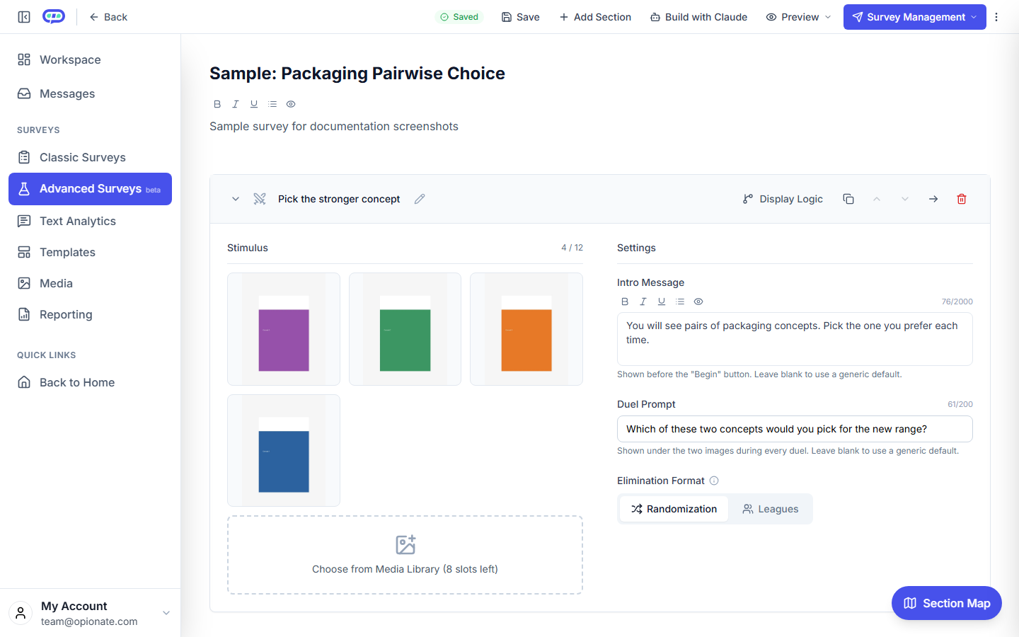
The builder: your logo directions, loaded as the comparison pool for the tournament.
Step-by-Step: Building a Logo Test
1. Prepare consistent renders. Export every logo direction at the same size, on the same background color, with the same amount of surrounding whitespace. Inconsistent presentation is the single most common source of bias in logo tests - see the best-practices section below for why this matters more than almost anything else on this list.
2. Create a Visual Test and add a Pairwise Comparison section.
3. Upload your logo directions. The section supports 2 to 12 images in one tournament, so even a full first-round set from an agency workshop fits comfortably.
4. Choose Randomization or Leagues, depending on how your set is actually structured. This is worth slowing down on, because the two modes are built for genuinely different situations, and picking the wrong one either wastes comparisons or hides information you wanted.
Choose Randomization - a single flat knockout across every direction you've uploaded - when your options are independent of each other: five unrelated concepts from an agency workshop, for instance, where there's no meaningful sub-grouping and you just want the strongest overall mark to surface from the full field. This is the right default for most first-round logo tests, and it's the simpler of the two setups.
Choose Leagues when your pool has a real internal structure you want respected rather than left to chance. The clearest case is testing the same core mark in multiple color or execution treatments alongside a genuinely different direction - say, three treatments of a wordmark-led concept and three treatments of an icon-led concept. Left to a flat Randomization knockout, it's entirely possible for two treatments of the same direction to eliminate each other in an early round, meaning the field narrows to a single treatment of that direction almost by accident, without every variant ever getting a fair look. Group each direction into its own league instead, and every treatment of the wordmark-led concept duels every other treatment of that same concept first, producing a clear champion for that direction - then the wordmark champion and the icon champion (and any other league champions) face off in a final round for the overall winner. Leagues is also the right call when you're comparing options from two different agencies or two different internal teams and you want a defensible answer to "did our strongest concept lose to their strongest concept," not just "something from their batch happened to survive the bracket."
5. Write a specific duel prompt tied to your actual brief. "Which logo feels more like a brand you'd trust with your data?" produces a far more useful signal than a generic "which do you prefer," especially if your brand has a specific positioning goal in mind - premium, approachable, technical, playful, whatever the strategic brief actually called for. Leave this blank and respondents see a sensible generic default, but a prompt tied to your real decision criterion is almost always worth the extra thirty seconds to write.
6. Set your intro message. This becomes the label attached to your results everywhere they appear, so it's worth writing it plainly and specifically rather than as filler copy: "We're choosing a new logo and want your honest first reaction. You'll compare two options at a time - just tap the one that feels right."
7. Preview the flow yourself, then publish and share the link with your team, your customers, or an external respondent source, exactly as you would any Opionate survey.
Full mechanics of how Randomization and Leagues actually run behind the scenes, and how the duel screen behaves for respondents, are covered in more depth in the Pairwise Comparison guide.
Digging Into the Finalists with a Stimulus Section
The tournament tells you which direction wins. It doesn't tell you why - and "why" is exactly what you need answered before committing a winning mark to years of production use across packaging, signage, a website, and everything else that'll carry it. Once you have a clear top pick (or two, if the result comes down close), add a Stimulus Section for each finalist: upload the logo, draw highlight areas around its distinct elements - the wordmark, the icon or symbol, the color - and ask a targeted question under each one. Does the icon read as clear and legible at a small size? Does the color feel appropriate for the category? Does the wordmark feel readable at a glance, not just on close inspection?
One detail worth knowing about this follow-up round: because Stimulus Section questions are ordinary questions living in your survey's normal question list, they support the same conditional display logic available anywhere else in Opionate - show or hide a question based on how someone answered an earlier one. That opens up a genuinely useful pattern for this exact situation: ask the icon-legibility question first, and if a respondent rates it poorly, automatically reveal a follow-up open-ended question asking what specifically would make it clearer, rather than showing that follow-up to everyone regardless of whether they had a complaint to explain. You get targeted qualitative detail exactly where there's a problem worth digging into, without padding the survey with an extra question for every respondent who had nothing critical to say.
Running this as a second, smaller round - just the finalists, not the full original field - keeps the respondent burden low while giving you the specific, actionable detail a forced-choice tournament alone was never going to provide on its own. It's the same "diagnose, then decide, then confirm" logic covered in more depth in our packaging concept testing guide, applied here to logos instead of packaging.
Best Practices for Framing Logo Options Fairly
- Identical presentation for every option. Same size, same background, same surrounding space. Any inconsistency reads as a quality signal to respondents and biases the tournament toward whichever version happens to look most "finished" or most polished in the render, not whichever mark is actually the strongest concept.
- Show the logo the way it'll actually be seen, where practical. A small app-icon-sized render if that's the primary real-world use case, a horizontal lockup if it'll mostly appear in a website header - testing a large, detailed hero render of a mark that'll spend most of its life as a 32-pixel favicon can give you a misleading read on what actually matters.
- Avoid mixing color and black-and-white versions in the same pool unless color itself is specifically what you're deciding between - otherwise you've quietly introduced a second variable into what was supposed to be a single, clean comparison.
- Keep the respondent pool relevant to your actual audience. A logo aimed at enterprise IT buyers and one aimed at consumer shoppers probably shouldn't be validated with the same generic panel - the "right" answer can genuinely differ by audience, and a mismatched panel will tell you that confidently and wrongly.
- Don't let internal stakeholders vote in the same pool as your real audience if you want a clean external read. Run an internal round and an external round separately if you want to compare the two - mixing them together makes it impossible to tell afterward whether your team's familiarity bias quietly tipped the result.
Reading Your Results
Once responses start coming in, you don't need to go looking for anything special to see how your tournament played out - open your survey's Report tab the same way you would for any other question, and you'll find the results for the intro-message question you wrote sitting right there alongside your survey's other data, ready to filter and export exactly like everything else. There's no separate export format to learn and no proprietary tournament dashboard to figure out; it behaves like the rest of your survey because, from a results standpoint, it is the rest of your survey.
If you want to sanity-check how decisively a direction won - whether it dominated from the very first round or scraped through several narrow duels along the way - every individual comparison in the tournament is recorded as respondents progress, not just the final tally, so that detail is there if you go looking for it rather than being thrown away once a winner is declared.
Illustrative Walkthrough: Five Directions Down to One
Picture a small startup narrowing a rebrand down to five logo directions from their design agency, with a board update in ten days and a team that's already split on which one they personally like best.
They build a Visual Test with a single Pairwise Comparison section, upload all five directions at identical size and background, and set the pairing mode to Randomization, since the five directions aren't natural sub-variants of one another - there's no shared underlying concept splitting into color treatments here, just five genuinely distinct options. The duel prompt reads "Which logo feels more like a company you'd trust with your data?" - specific to their actual positioning goal rather than a generic preference question that could mean almost anything. The intro message explains the exercise plainly and asks for a gut reaction rather than a considered analysis.
The link goes out to a mix of existing customers and a small external panel. Each respondent works through four duels before landing on a personal pick. When the results come in, the Report tab shows one direction pulling a clear plurality - a result the founder didn't expect, since it wasn't their personal favorite in the original internal debate. Rather than override it on gut feel, the team adds a follow-up Stimulus Section testing just that winning direction and one close runner-up, highlighting the icon and wordmark separately, and confirms the icon reads clearly at small sizes before finalizing it ahead of the board update - catching, in the process, that the runner-up's wordmark was genuinely harder to read at a glance, a detail nobody had flagged in the original internal debate.
FAQ: Logo Testing Questions
How many logo directions can I test at once?
Up to 12 in a single Pairwise Comparison section's knockout.
Is "Pairwise Comparison" the same thing as forced-choice testing, or head-to-head testing?
Yes - these are different names researchers use for the same underlying method: showing two options at a time and forcing a relative choice instead of an absolute rating. Opionate's Pairwise Comparison section is that method run as a full single-elimination tournament across your whole set of logo directions.
Should I test full color versions, black-and-white, or both?
Pick one per test unless color itself is what you're deciding - mixing them turns your logo test into an unintentional color test.
Can I test sub-variants of the same direction, like three color treatments of one mark?
Yes - use Leagues mode to group variants by direction, so each direction's variants compete with each other first, and the strongest version of each direction then faces off against the other directions in a final round.
Is a forced-choice tournament actually better than just asking people to rate each logo?
For separating close options, yes - rating scales compress differences toward the middle, while a forced binary choice produces an unambiguous signal on every single comparison. See our pairwise comparison guide for the full reasoning behind why this matters more as your option count grows.
What if the tournament winner isn't what our internal team expected?
That's common, and it's genuinely the point of testing external reaction rather than relying on internal familiarity bias. Following up with a Stimulus Section on the top finalists usually explains why respondents landed where they did, even when it wasn't the outcome anyone on the team predicted.
Can I combine an internal team vote with external respondent feedback?
Yes, but run them as separate fieldings if you want a clean read on each - mixing internal and external voters into one pool makes it impossible to tell afterward which group actually drove the result.
Let Real Reactions Break the Tie
A room full of opinions rarely agrees on a logo. A forced-choice tournament gives you an unambiguous winner - and a follow-up Stimulus Section tells you exactly why it's working before you commit.
Start a Visual Test on Opionate and upload your logo directions - the tournament and the follow-up feedback run in the same tool you already use.