
You've got three homepage hero concepts, two packaging mockups, or a 15-second product video, and a stakeholder meeting in four days. You need real feedback - not "looks good!" from six people on Slack, not a star rating that tells you something felt off without saying what. You need to know: did people notice the new call-to-action button, did the headline register at all, which of the two badge placements actually reads as "trustworthy" instead of "cluttered." Nobody in that stakeholder meeting is going to be satisfied with "people rated it a 3.4 out of 5" - they're going to ask why, and if the honest answer is "we don't know, we only asked for an overall score," that's a bad meeting.
The usual fallback is a slide deck with numbered screenshots, a mockup pasted into an email with "thoughts?" typed above it, or a generic "rate this image 1-5" question bolted onto a survey tool that was built for text and multiple choice, not visuals. Replies trickle back as loose comments - "the header feels off," "not loving the bottom section" - and now someone on the team has to sit down and manually figure out what each comment is actually about before anyone can act on it. None of these methods tell you where on the image a reaction is coming from, which means the most useful part of the feedback - the specific thing to fix - never actually gets captured. It has to be reconstructed afterward, by hand, from vague language, and reconstruction is where good feedback quietly turns into a shrug.
Opionate's Stimulus Section was built to close that gap. It's a survey section type that puts an image, video, or 3D model directly in front of respondents, lets you draw labeled highlight areas over the specific parts you want feedback on, and attaches your questions to those exact areas - so when someone answers "What don't you like about the header?", you already know they're looking at the header and nothing else on the page. This guide covers how the feature works end to end, how to structure a concept test, and the patterns that produce feedback you can actually act on rather than feedback you have to interpret.
Before going further, it's worth a quick note on terminology, because this space uses a couple of overlapping terms that don't quite mean the same thing. You may have run into "hotspot testing" or "click testing" before, and it's tempting to assume that's what this is. It isn't, and the distinction matters: in a click-tracking or heatmap tool, a "hotspot" is something the tool discovers by recording where real people click or tap on an image, unprompted, with no direction from the researcher. A Stimulus Section's highlight areas work in the opposite direction - you draw them yourself, before a single respondent sees the image, to mark the specific regions you already know you want feedback on, and then you attach a direct question to each one. Same underlying instinct (draw attention to a specific part of an image), but creator-directed instead of respondent-discovered. If what you're after is "where would people naturally look without being told," that's a click-heatmap test, and we cover exactly where those tools fit (and where they don't overlap with this feature) later in this guide. If you already know which parts of a design are in question and want structured answers about each one, that's what a Stimulus Section is for.
Table of Contents
- Why "Attach a Screenshot and Ask" Doesn't Work
- What a Stimulus Section Actually Is
- The Anatomy: Stimulus, Highlights, and Linked Questions
- Step-by-Step: Building Your First Stimulus Section
- Design Patterns That Get Clear Feedback
- What You Get Back: Analytics and Exports
- Best Practices
- Directed Feedback, Not Undirected Attention Data
- Illustrative Walkthrough: Testing a Packaging Redesign
- FAQ
Why "Attach a Screenshot and Ask" Doesn't Work
The problem: most survey tools treat an image as decoration, not as the subject of the question. You can embed a picture above a text field, but the tool has no idea that respondents are looking at a specific region of it, and no way to tell one respondent's reaction to the logo apart from another respondent's reaction to the button three inches below it. Every answer you get back is disconnected from the part of the design it's actually about, which means the real work of figuring out what someone meant happens after the data comes in, by hand, by someone squinting at a spreadsheet of open-text comments trying to guess what "the top part" refers to.
This shows up in a few predictable, frustrating ways once a design review actually gets underway:
- Vague feedback with no location. "The bottom section is confusing" tells you there's a problem but not which element is causing it - the pricing table, the FAQ, the footer nav - so the very first thing anyone has to do with that feedback is go figure out what it's even about before they can act on it.
- Feedback that drifts between test subjects. Ask an open-ended question under three different concept images in the same survey, and respondents start comparing across images instead of answering about the one directly in front of them, muddying your read on any single concept and making it hard to tell whether a comment about "the color" belongs to concept A or concept B.
- One rating for a whole page. A single "How does this design make you feel? (1-5)" question averages out very different reactions to the logo, the hero copy, and the button color into one number that tells you nothing about what to change, only that something, somewhere, didn't quite land.
- No way to ask different questions about different parts of the same image. If you want one question about the headline and a different question about the pricing table, most builders force you into separate images, separate sections, or separate surveys entirely - losing the fact that respondents are reacting to one coherent design, not five unrelated ones.
- Manual screenshot-and-slide workflows don't scale. Pasting numbered screenshots into a deck and collecting comments in a spreadsheet works fine for five reviewers who already know the project inside out. It falls apart at fifty respondents, and even when it technically "works," it produces no analyzable data - just a pile of comments somebody has to read one by one and manually sort into themes before anyone can act on them.
The pattern underneath all of these: general-purpose survey tools (Google Forms, Typeform, SurveyMonkey, and even Opionate's own standard survey builder) are optimized for questions about a topic, not questions about a specific region of an image. Getting structured, location-aware feedback needs a section type built for that job specifically, rather than a workaround bolted onto a tool that was never meant to hold that kind of information in the first place.
What a Stimulus Section Actually Is
A Stimulus Section is one of three section types available inside Opionate's Visual Tests product (the other two are plain Questions sections and Pairwise Comparison sections, covered in a companion guide on tournament-style preference testing). It's the section type designed specifically around one uploaded file, built from three things layered on top of it:
- The stimulus itself. An image (PNG/JPG/JPEG), a video (MP4/WEBM), or a 3D model (GLB/GLTF), uploaded once per section, up to 50MB.
- Highlight areas. Rectangular regions you draw directly on top of the image by clicking and dragging, each with its own short label (e.g., "Primary CTA," "Price badge," "Hero headline").
- Linked questions. Any question in the section can be tied to one or more highlight areas. When a respondent reaches that question, the tool draws attention to the linked area on the image rather than showing the whole design as undifferentiated background.
Because the highlight areas and the questions live in the same section, you can ask several different questions about several different parts of the same image, and every answer stays connected to the exact region it's about - no more guessing whether "the header feels off" means the logo, the nav, or the search bar sitting right next to it.
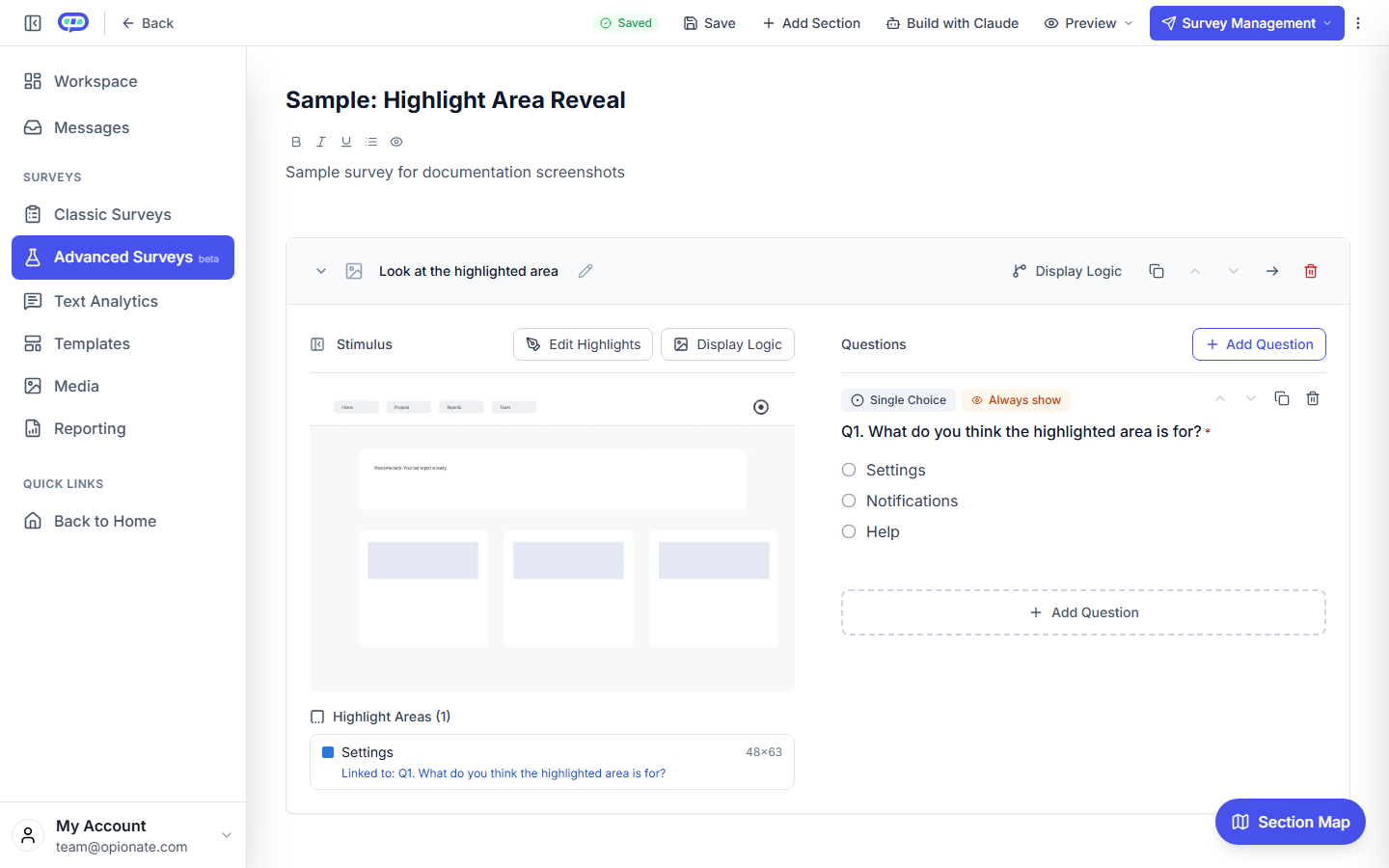
The builder: a highlight region is listed under the image and linked to its question.
The Anatomy: Stimulus, Highlights, and Linked Questions
It helps to think of a Stimulus Section as three layers stacked on top of each other, each one controlled independently but working together at survey-taking time:
| Layer | What it controls | Who sets it |
|---|---|---|
| Stimulus | Which file (image/video/3D model) this section shows, and its position in the overall test | Creator, at section setup |
| Highlight areas | Labeled rectangular regions drawn on the image, each representing one part of the design worth asking about | Creator, using click-and-drag drawing directly on the uploaded image |
| Question-to-highlight map | Which highlight area (if any) lights up when a given question is on screen | Creator, per question |
A few details worth knowing before you build, since they shape how much control you actually have over the experience:
- Not every question needs a highlight. A general "What's your first impression?" question can show the full, unhighlighted image. Only questions that are genuinely about a specific region need to be linked to one.
- A question can show the image without owning a highlight. If you want a question to keep the image visible without drawing attention to any one area, the section supports that too - the image simply displays in full alongside the question rather than staying hidden, useful for a question that's about the design as a whole rather than any single element within it.
- Highlights are visual, not clickable hit-targets. As covered in the terminology note above, they're drawn to focus attention, not to capture click-coordinate or heatmap data - if your goal is literally tracking where someone clicks first, that's a different kind of test than what this section is built for.
- One stimulus per section, multiple sections per test. If you're comparing three homepage concepts, you build three Stimulus Sections (one per concept) inside a single Visual Test, so respondents move through them in order and you can compare answers question-by-question, concept-by-concept.
- Questions inside a Stimulus Section support the same display logic as anywhere else in Opionate. Because they're ordinary questions sitting in your survey's normal question list, you can show or hide any of them based on how someone answered an earlier one - a genuinely useful pattern if, say, you only want a follow-up open-ended question to appear when a highlight-linked rating comes back negative, rather than asking every respondent to explain a complaint most of them didn't have.
Step-by-Step: Building Your First Stimulus Section
1. Create a Visual Test. From your workspace, start a new Visual Test - it lives in its own "Visual Tests" area alongside your standard surveys, not buried inside your regular survey list.
2. Add a Stimulus Section and upload your file. Drag and drop your image, video, or 3D model (up to 50MB). This becomes the backdrop for every question in the section, so it's worth double-checking you've got the right version uploaded before you start drawing highlights on top of it.
3. Draw your highlight areas. Click and drag directly on the uploaded image to draw a rectangle around each element you want feedback on, then give it a short, specific label ("Hero CTA button," not "Button 1"). You can add as many highlight areas as your design genuinely has distinct elements worth asking about - though see the best-practice guidance below on why fewer, sharper highlights beat a dozen overlapping ones. Take the labeling step seriously here: it's not just an organizational convenience inside the builder, it's what shows up wherever that highlight is referenced later, including in your exported results.
4. Add your questions. Use any of Opionate's standard question types - single choice, multiple choice, open-ended, rating, yes/no.
5. Link each question to a highlight (or leave it general). For any question that's about a specific area, select the matching highlight so it's shown alongside that question during the test. Questions that don't need a highlight can either show the full image or skip it, depending on what you choose. If you want a question to only appear under certain conditions - say, a follow-up that should only show up when an earlier answer flagged a problem - this is also the point to set up that display logic, so the section adapts to what a respondent has already told you rather than asking everyone the same fixed sequence regardless of their answers.
6. Repeat for additional concepts. Add another Stimulus Section for your second design, third design, or next screen in a flow - each with its own stimulus, its own highlights, and its own linked questions, entirely independent of the others.
7. Preview before publishing. Step through the test yourself to confirm the right highlight appears with the right question, then publish and share the link.
Design Patterns That Get Clear Feedback
First-impression concept review. Lead the section with an unhighlighted, full-image question ("What's your overall first reaction to this design?"), then follow with two or three highlight-linked questions on the specific elements you're least confident about (a new nav pattern, a pricing table redesign, a hero illustration). Asking the general question first matters more than it might seem - it captures an honest, unprompted reaction before you've told anyone where to look, which you'd lose entirely if you led with the highlights.
Element-specific critique. If you already know which parts of a design are contentious internally - a headline your team is split on, a badge that might read as clutter - skip the general question entirely and go straight to highlight-linked questions on just those elements. This keeps the test short and the feedback tightly focused on the actual open questions your team is trying to resolve, rather than re-litigating parts of the design nobody was unsure about in the first place.
Packaging and print concept testing. Upload a product shot or packaging mockup, draw highlights around the logo lockup, the claim/benefit copy, and the color block, and ask a targeted question under each - far more diagnostic than a single "Do you like this packaging?" question, and specific enough to hand straight to whoever's finalizing print files. Our packaging concept testing guide covers this pattern in more depth, including how to pair it with a Pairwise Comparison round to pick a final winner.
Video and motion concept testing. Upload an MP4 of a product demo or ad concept and ask general reaction questions underneath it - useful for gut-check reactions to pacing, tone, or a specific scene, even without frame-level highlighting, since video doesn't lend itself to the same static-region highlighting an image does.
Sequential screen review. For a multi-step flow (an onboarding sequence, a checkout process), give each screen its own Stimulus Section in order, so respondents react to each step individually rather than trying to hold the whole flow in their head and comment on all of it at once - the same reason you wouldn't ask someone to review five pages of a document in a single open-text box.
Pairing with a Pairwise Comparison section. Use a Stimulus Section to gather why people react the way they do to individual concepts, then follow it with a Pairwise Comparison section later in the same test to force a head-to-head ranking across all the concepts - qualitative depth from the highlights, quantitative preference ranking from the tournament, both from the same fielding rather than two separate studies with two separate respondent pools that might not even agree with each other.
What You Get Back: Analytics and Exports
Results flow through the same analytics and export tools you already use - no separate dashboard to learn, no proprietary format to figure out:
- Standard analytics for standard question types. Single choice, multiple choice, rating, and yes/no questions inside a Stimulus Section are analyzable with Opionate's AI-powered analytics the same way they are anywhere else - distribution breakdowns, comparisons, and natural-language queries, all available without any special setup.
- CSV export. Every answer exports in the same wide-format, one-row-per-respondent CSV as any other survey, ready for Excel, SPSS, or R, with no reformatting required to get it into whatever tool your team already analyzes data in.
- DOCX export with the highlights reproduced. This is the detail most design-feedback tools skip entirely: when you export a Stimulus Section to Word, each question renders with its stimulus image re-embedded directly next to it - and if that question was linked to a highlight area, the highlight is redrawn on top of the image in the export, using the same color for the same area every time. You get a document a stakeholder can skim and immediately see which part of the design each answer is about, without opening the live survey or asking someone to re-explain which comment belonged to which element.
- Open-ended answers, ready for thematic coding. If you're running open-ended questions under your highlights ("What would you change about this?"), those responses are exactly the kind of structured, location-tagged qualitative data that's easiest to theme - see our thematic analysis guides for how to turn a batch of "what would you change" answers into a short list of concrete fixes instead of a wall of raw comments nobody has time to read end to end.
Best Practices
- Fewer, sharper highlights beat many overlapping ones. Three or four well-chosen areas focus attention where it actually matters. Ten overlapping rectangles make the image look busy, and respondents stop reading labels carefully once the image starts to feel cluttered with them.
- Label highlights the way a teammate would describe them, not a designer. "Price badge" beats "Element 3" - the label doesn't just organize your builder while you're setting things up, it shows up wherever that highlight is referenced later, including in front of respondents and in your exported results.
- Keep the stimulus at a reasonable file size. You have up to 50MB per file, but a heavily compressed, web-ready image or video loads faster for respondents on mobile and reduces drop-off before they even reach the first question - a slow-loading stimulus is a real, if easy to overlook, source of incomplete responses.
- Ask one clear thing per highlight-linked question. "What's your reaction to the CTA button?" gets a usable answer. "What do you think about the button, its color, and its placement?" gets three different answers crammed into one text field, which defeats the purpose of having drawn a precise highlight around a single element in the first place.
- Open with general impressions before drilling into highlights. A first-reaction question primes honest, unprompted feedback before you start pointing at specific elements - which naturally biases people toward commenting on what you pointed at, so the order you ask things in genuinely changes what you learn.
- Test one variable's worth of concepts per test when possible. If you're comparing three logo options, keep the surrounding layout identical across all three Stimulus Sections so the highlight areas map to the same regions and answers stay comparable concept-to-concept, rather than accidentally testing layout differences alongside the thing you actually meant to compare.
- Use display logic sparingly, but use it where it earns its keep. A follow-up question that only appears when an earlier rating comes back negative keeps your test short for respondents who had nothing critical to say, while still capturing detail exactly where a real problem surfaced.
Directed Feedback, Not Undirected Attention Data
It's worth being precise about what kind of tool a Stimulus Section is, because "testing an image with real people" covers a couple of genuinely different research questions that are easy to lump together. One family of tools exists to capture undirected attention - show someone an image with no instructions, record where they click or how long they look at each region, and aggregate that across enough respondents to produce a heatmap. That's a real and useful thing to know, and it answers a real question: where would people naturally look or reach for something, with zero guidance from you.
A Stimulus Section is built for a different question entirely: not "where would attention land on its own," but "what do people think about this specific thing, and what do they think about that specific thing, once I point them at each one directly." That's a directed method, not an undirected one - you're the one deciding which regions matter enough to ask about, and every highlight comes with a real question attached to it, not just a click recorded and left to speak for itself. Neither approach is more rigorous than the other; they're just answering different questions; a heatmap tool would never tell you why a redesigned pricing table isn't landing, and a Stimulus Section was never going to tell you where someone's eye drifted before they'd formed an opinion about anything.
The practical result is that a Stimulus Section is the right tool once you already have a handful of specific things you're unsure about - a new CTA, a claim callout, a color choice - and want a structured, exportable answer for each one, tied clearly enough to the region it's about that nobody has to guess what a comment refers to six weeks later when the export gets reopened for a different meeting.
Illustrative Walkthrough: Testing a Packaging Redesign
Picture a small consumer goods team choosing between two packaging concepts for a product relaunch, with a print deadline in two weeks and no budget for a dedicated research panel.
They build one Visual Test with two Stimulus Sections - Concept A and Concept B, each showing a front-of-pack render. In each section, they draw three highlight areas: the logo lockup, the flavor/benefit callout, and the color block behind the product name. Under the logo highlight, they ask a single-choice question about whether it reads as premium or budget. Under the callout highlight, an open-ended question asks what the callout communicates in the respondent's own words. Under the color block, a rating question asks how well the color fits the brand.
They open the general "first reaction" question with no highlight at the top of each section, so early answers aren't anchored by the highlights that follow. The link goes out to their existing customer list and a short paid respondent panel, collecting responses over three days.
When results come in, the single-choice logo question shows a clear split by concept - one design reading as noticeably more premium - which Opionate's analytics surfaces as an instant distribution comparison. The open-ended callout answers, exported and skimmed in bulk, reveal that several respondents misread one concept's benefit copy entirely, a fix the team can make before the print deadline regardless of which design wins. The DOCX export, with each highlight redrawn on its image, becomes the one-page summary they walk into the stakeholder review with - no rebuilding screenshots, no re-explaining which comment was about what.
FAQ: Stimulus Section Questions
Is a Stimulus Section the same thing as hotspot testing or a click test?
No, and this is worth being precise about - "hotspot" gets used to mean two different things in this space. Click-tracking or heatmap tools discover hotspots by recording where respondents click unprompted. A Stimulus Section's highlight areas are the opposite: the creator draws them ahead of time to mark specific regions and attach a direct question to each one.
What file types and sizes are supported?
Images (PNG, JPG, JPEG), videos (MP4, WEBM), and 3D models (GLB, GLTF), up to 50MB per file.
How many highlight areas can I add to one image?
There's no hard cap in the builder, but for respondent clarity, keep it to a handful of genuinely distinct elements rather than covering the image in overlapping boxes.
Can one question link to more than one highlight area?
Yes - a question can be tied to multiple highlight areas at once if it's genuinely about more than one element together.
Do highlight areas track clicks or generate a heatmap?
No. Highlights are drawn by the creator to focus respondent attention on a specific region and are reproduced in exports - they're not a click-tracking or heatmap feature.
Can I use display logic to show or hide questions inside a Stimulus Section?
Yes - questions inside a Stimulus Section are ordinary questions, so they support the same conditional display logic available anywhere else in Opionate, such as only showing a follow-up question when an earlier answer flagged a problem.
Can I use AI-powered analytics on the answers?
Yes, for the standard question types (single choice, multiple choice, rating, yes/no) inside a Stimulus Section, the same natural-language analytics available on any Opionate survey applies.
Does the highlight show up when I export to Word?
Yes - each question's DOCX export re-embeds its stimulus image with the linked highlight area redrawn on top, using a consistent color per area.
Can I mix Stimulus Sections with regular question sections in one test?
Yes - a Visual Test can combine Stimulus Sections, plain Questions-only sections, and Pairwise Comparison sections in any order.
Is this the same as a first-click or eye-tracking test?
No. It's a targeted-feedback tool - it puts a labeled area in front of a respondent and asks a direct question about it, rather than recording where someone clicks or looks unprompted.
How is this different from just embedding an image above a question in a normal survey?
An embedded image is static background - every question under it gets the same undifferentiated picture. A Stimulus Section's highlight-to-question mapping means different questions can point at different, labeled parts of the same image, and that connection is preserved in analytics and exports.
Get Structured Feedback on Your Next Design
Screenshots in a slide deck and "thoughts?" in a Slack thread get you opinions. A Stimulus Section gets you answers tied to the exact part of the design they're about - answers you can filter, export, and hand to a stakeholder without translation.
Start a Visual Test on Opionate and upload your first concept - no separate research tool or respondent panel required to get going.