
Exporting a dashboard straight to PowerPoint saves real, meaningful time over the old alternative - manually rebuilding every chart from scratch in a slide deck, matching colors and labels by eye, hoping nothing gets transcribed wrong along the way. That time savings comes with one detail worth knowing before you rely on it for a client-facing deck: not every chart type exports the same way. Standard charts come out as fully editable PowerPoint objects a colleague can click into and adjust later. A handful of the less common chart types come out as flat images instead - identical in appearance, but not editable after the fact. Knowing which is which changes how you'd structure a dashboard that's headed for a slide deck.
Table of Contents
- Editable Objects vs. Flat Images
- Which Chart Types Export Which Way
- Designing a Dashboard That Exports Cleanly
- What to Check Before Sending the Export Onward
- A Worked Example
- FAQ
Editable Objects vs. Flat Images
An editable PowerPoint chart is a native object - the kind you can double-click after export to open its underlying data table and adjust a number, a label, or a color directly inside PowerPoint itself, the same as if you'd built the chart natively in the slide software. An image-based chart looks visually identical on the slide, but is really just a picture - clicking it selects the image as a whole, the same as any photo dropped into a deck, with no way to reach the underlying data or tweak an individual element without going back to the source dashboard and re-exporting. Both look the same in a live presentation. The difference only matters the moment someone tries to edit the slide afterward.
Which Chart Types Export Which Way
The standard, most commonly used chart types - bar, column, line, scatter, doughnut, pie, and their stacked variants - export as fully editable native objects, meaning a colleague can open the exported deck later and adjust these charts directly in PowerPoint without needing to touch the original dashboard at all. Waterfall, treemap, polar area, and lollipop charts export as flat images instead - visually accurate at the moment of export, but not something anyone can click into and adjust afterward. This isn't a bug or a missing feature so much as a reflection of how PowerPoint's own native chart engine works - it has built-in support for the standard chart types and no native equivalent for the less common ones, so those get flattened to an image to preserve their appearance rather than being forced into an unsupported native format.
Designing a Dashboard That Exports Cleanly
Knowing this distinction in advance changes a genuinely practical decision: if a dashboard is being built specifically for a recurring export - a report that goes out as a slide deck every quarter, edited by someone other than the original builder each time - leaning on standard chart types where the choice is reasonably close between two options gives that downstream editor more flexibility later, since they'll be able to adjust labels, resize, or restyle without looping back to the source dashboard. This doesn't mean avoiding waterfall or treemap charts where they're genuinely the better fit for what's being communicated - our guide on waterfall, lollipop, and treemap charts covers when they're worth using regardless - it just means factoring the export format into that choice when the two options are otherwise close, and being deliberate about it rather than discovering the limitation after a deck has already gone out.
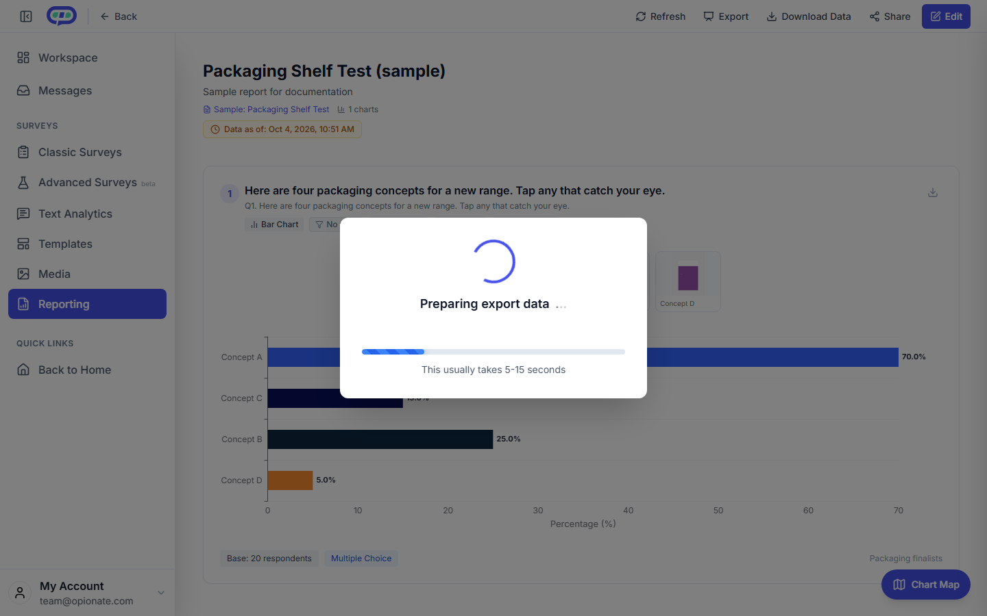
What you see while Opionate builds the deck - typically five to fifteen seconds.
What to Check Before Sending the Export Onward
A quick review of any freshly exported deck catches most of what's worth catching before it reaches an external audience. Confirming that any image-based charts (waterfall, treemap, polar, lollipop) still read correctly at the specific slide size and resolution being used matters more for images than for native objects, since an image can't be nudged or rescaled without some quality loss the way a native chart can. Checking that the export reflects the current, intended state of the dashboard - not a stale version from an earlier working session - is worth a deliberate look, especially if the dashboard has been actively edited recently. And for any deck that's going to be edited further by someone other than the original builder, a short note flagging which specific slides contain image-based charts (and therefore need to go back to the source dashboard for any data changes) saves that future editor from a frustrating, confusing few minutes discovering it themselves mid-edit.
A Worked Example
A consulting team builds a client-facing quarterly dashboard that includes a waterfall chart explaining a revenue bridge and several standard bar and line charts for the rest of the metrics. Exporting to PowerPoint for the client meeting, the standard charts come out fully editable - useful, since the account lead often tweaks a label or highlights a specific bar live during the meeting based on how the conversation goes. The waterfall chart exports as an image, which the team knows in advance and plans around: rather than trying to edit it live if a number needs adjusting mid-meeting, they keep the source dashboard open in a second window specifically for that one chart, ready to make a change there and re-export just that slide if needed, rather than being caught off guard trying to click into an image that won't respond the way the rest of the deck does.
FAQ
Can I convert an image-based exported chart into an editable one after the fact?
Not within PowerPoint itself - the underlying chart data isn't preserved in the image. Any changes need to happen on the source dashboard, followed by a fresh export of that specific chart or the whole deck.
Does the image-export limitation affect how the chart looks in a live presentation?
No - visually, an image-based chart and a native object look identical when presented. The difference only becomes relevant if someone tries to edit the slide afterward.
Should I avoid waterfall and treemap charts entirely if I know a dashboard will be exported?
Not necessarily - they're often still the clearest way to communicate the specific pattern they're built for, covered in our guide on when the unusual chart is the right one. It just means planning for the fact that any post-export edits to those specific charts need to route back through the source dashboard.
Is there a way to tell which charts in an exported deck are images versus editable objects without clicking each one?
Right-clicking a chart in PowerPoint shows different available options depending on the type - a native object offers a "Edit Data" option, while an image doesn't. Checking this once per chart type when building the habit is usually enough to remember which is which going forward.
For more on choosing chart types and building dashboards that hold up under real-world use, see Waterfall, Lollipop, and Treemap Charts: When the Unusual Chart Is the Right One and What to Consider Before Sharing a Dashboard With a Public Link.