
In the high-speed market, we have officially moved beyond the era where mobile-optimized design was a "nice-to-have" feature; it is now the definitive standard for data integrity. As of 2024, global smartphone ownership has crossed the 7 billion threshold, and nearly six out of ten surveys are now completed on mobile devices, a trend that has seen mobile responses outpace non-mobile counterparts for the past five consecutive years.
This shift isn't just about screen size it's about a fundamental change in how humans interact with information. If your survey feels like a desktop form shrunk down to fit a glass rectangle, you aren't just losing respondents; you’re introducing a massive non-response bias. Younger generations (Gen Z and Millennials) are twice as likely to trust a survey only if it features a modern, mobile-responsive design.
This guide serves as a comprehensive manual for researchers to bridge the gap between "sending a link" and "securing an insight."
1. The Ergonomics of Engagement: Designing for the Thumb
The physical reality of a smartphone dictates the structural architecture of your survey. Unlike a desktop where a high-precision cursor handles the work, mobile interaction is dictated by the biomechanics of the human hand.
The Thumb Zone
Approximately 94% of mobile users interact with their devices in a vertical orientation, often using only one hand. This creates a "Thumb Zone"the area of the screen most easily reachable. To minimize physical strain and accidental abandonment, your primary navigation and buttons must be placed within the lower half of the screen.
The Anatomy of Touch
Precision is significantly lower on a touchscreen. To prevent "fat-finger" errors a leading source of user frustration you must adhere to minimum touch target standards.
| Element Type | Recommended Size | Impact on Completion |
|---|---|---|
| Primary Action Buttons | 44x44 to 48x48 px | Reduces accidental "Next" clicks. |
| Radio Buttons/Checkboxes | 44x44 px (hit area) | Prevents selection of adjacent options. |
| Navigation Menus | 48 px height | Faciliates easy one-handed movement. |
Implementing these standards can reduce user errors by nearly 25%, transforming a "clunky" form into a smooth, responsive experience.
2. Typography and Readability in a High-Distraction World
Mobile users are rarely in a quiet office. They are commuting, shopping, or multi-tasking. Their cognitive capacity for parsing dense text is limited. If a respondent has to zoom in to read your question, they are 60% more likely to close the tab.
- Minimum Font Size: Never go below 16px for body text.
- Chunking: Break instructions into short paragraphs of 2-3 sentences max.
- High Contrast: Aim for a minimum ratio of 4.5:1 to ensure your survey is readable even in bright sunlight or high-glare settings.
A Matrix Grid on Mobile
- Tiny radio buttons crammed into a scrollable table
- Forces pinch-zooming just to tell rows and columns apart
- A leading cause of mobile survey abandonment
One Question at a Time
- Each row becomes its own full-width question
- No zooming, no squinting, no mis-tapped cell
- Built for the thumb, not shrunk down from a desktop form
3. The Death of the Matrix Question
For decades, the matrix (or grid) question was the darling of market researchers. It allowed for dozens of data points on a single desktop screen. On mobile, however, the matrix question is where surveys go to die.
Horizontal scrolling on a smartphone is the "treacle" of UX design. When a user has to scroll left and right to see the scale (e.g., "Strongly Agree" to "Strongly Disagree"), they lose track of the question context.
The Modern Alternative: Individual Likert Scales
Instead of one massive grid, break your questions into individual rating scales or a single-question-per-page layout. This "chunking" reduces visual overwhelm and keeps the user focused on a single task. Data shows that moving away from matrix grids leads to a significant increase in mobile completion rates.
4. Technical Performance: The Three-Second Rule
Technical failure is the most common "silent" cause of attrition. Research consistently shows that 53% of users will abandon a survey if it takes longer than three seconds to load. On variable cellular networks (4G/5G), every kilobyte of page weight matters.
Optimization Strategies:
- Image Compression: Use modern formats like WebP or AVIF. These can reduce file sizes by up to 90% without losing quality.
- Lazy Loading: Ensure the browser only downloads images as they enter the user's viewport.
- Critical-Path Rendering: Prioritize the loading of the question text and layout first, delaying heavy scripts or external fonts for the background.
5. Accessibility as a Usability Catalyst
Designing for accessibility isn't just about legal compliance; it’s a catalyst for overall usability. A survey that is easy for a user with a visual impairment to read is also easier for a busy professional to read while walking between meetings.
The POUR Principles:
- Perceivable: Provide alt-text for icons so screen readers can describe them.
- Operable: Ensure large touch targets and avoid gesture-only interactions (like shaking the phone).
- Understandable: Use clear, concise language.
- Robust: Use semantic HTML so the survey works across different browsers (Safari, Chrome, In-app browsers).
6. Strategic Distribution: Timing and Incentives
The timing of your invitation is just as critical as the design of the survey itself.
- The Golden Window: Tuesday between 10:00 AM and 11:00 AM is consistently the most effective time for distribution.
- The Reciprocity Principle: Using a small pre-incentive ($1 up-front) is often more cost-effective than a larger post-completion reward. When respondents receive value up-front, they feel a social obligation to provide high-quality, thoughtful answers.
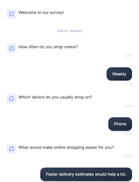
A mobile-first, chat-based take experience - built for the thumb from the start.
7. The Conversational Pivot: Frictionless Intelligence with Opionate
While the strategies above will improve any traditional survey, the reality is that users are increasingly rejecting "forms" entirely. They spend their lives in messaging apps so in order to capture their attention, market research must speak their language.
Introducing Opionate Chat-Based Surveys
At Opionate, we have moved beyond the "form" paradigm to a Conversational Survey Interface. This feature transforms the traditional, static experience into a dynamic, chat-based interaction that mimics a natural instant messaging conversation.
Why Chat-Based Surveys Outperform Traditional Forms:
- 85% Completion Rates: While traditional web forms struggle with a 22% completion rate on mobile, our chat-based interface reaches upwards of 85%.
- 70% Lower Cognitive Load: By presenting only one question at a time in a familiar chat bubble, we prevent the "survey fatigue" that causes users to exit.
- Reduced Drop-off: In a conversational format, the "drop-off per question" falls from a staggering 18% in traditional forms to just 3%.
- Familiarity Bias: Mobile users send an average of 100 texts daily. By using a chat interface, the survey feels like a natural extension of their behavior rather than an "interrogation" or a piece of homework.
Frictionless by Design
Opionate's chat feature leverages converstional design to maximize the engagement, ensuring higher completion rate and respondent experience. Respondents are also more receptive to open-ended questions, reducing chances that you'll receive answers like "N/A" or a reluctantly short answer but a more informative, dedicated piece of advocacy.
Join Opionate for the ultimate evolution of mobile-first research and utilize a system that respects the user's environment, leverages their habits, and delivers strategic intelligence in minutes, not hours.
References
- Barmuda (2025). Conversational vs. Traditional Surveys: A Complete Data-Driven Comparison.
- Google DoubleClick (2016). The Need for Mobile Speed: How Mobile Latency Impacts Publisher Revenue.
- Hoober, S. (2013). How Do Users Really Hold Mobile Devices? UX Matters.
- Qualtrics (2024). 4 Tips for Preventing Drop-Offs in Surveys.
- Rival Technologies (2025). The Voice of the Participant: 2025 RoR Benchmark Report.
- SurveyMonkey (2025). State of Surveys 2025: The Move to Mobile and More Survey Trends.
- SurveySparrow (2025). Mobile Survey Completion Rates Hit 85%: New Benchmark Study Reveals Why.