
Net Promoter Score has become one of the most tracked numbers in business and, for a lot of teams, one of the least acted on. It goes into a quarterly dashboard, it moves a few points in one direction or the other, someone notes whether that's good or bad, and then everyone moves on until next quarter's number comes in. The trouble isn't that NPS is a bad metric - it's a genuinely useful, well-validated signal of overall relationship health. The trouble is that the score by itself is a lagging indicator: by the time it drops, whatever caused the drop already happened, and the number gives you no mechanism for figuring out what that was. This guide is about getting past tracking the score and into actually analyzing it.
Table of Contents
- What NPS Actually Measures
- Why the Score Alone Doesn't Tell You What to Do
- Finding Your Actual NPS Drivers
- What a Moving Score Actually Tells You
- Common NPS Analysis Mistakes
- FAQ
What NPS Actually Measures
NPS comes from one question: how likely are you to recommend this to a friend or colleague, usually on a 0-to-10 scale. Respondents who answer 9 or 10 are counted as promoters, 7 or 8 as passives, and 0 through 6 as detractors, and the score itself is the percentage of promoters minus the percentage of detractors - which means it can range from -100 to +100, and a positive score simply means you have more promoters than detractors.
What it's actually capturing is closer to overall relationship sentiment than satisfaction with any one interaction - it's less "how did that support ticket go" and more "on the whole, how do you feel about this company enough to put your own reputation behind recommending it." That's a genuinely valuable thing to know, and it correlates reasonably well with long-term loyalty and growth across a lot of industries. But it's also, by design, a single number that collapses a huge amount of nuance into one digit, which is exactly why it can't tell you what to fix on its own.
The Score Alone
A single number, 0 to 100 - accurate, and not yet actionable on its own.
The Score + Drivers
What's actually moving it - the part a bare number never shows.
Why the Score Alone Doesn't Tell You What to Do
If your NPS comes in at +30, what changes? If it drops to +15 next quarter, what specifically do you do differently? The number alone can't answer either question, because it doesn't tell you why people scored the way they did - whether promoters love your product, your support, your pricing relative to competitors, or something else entirely, and whether detractors are detracting for a reason you could actually fix or one you can't. A rising or falling score is a symptom, and treating a symptom without a diagnosis is how you end up making changes that don't move the number, because you were never actually addressing what was driving it in the first place.
Finding Your Actual NPS Drivers
The score becomes genuinely useful the moment you stop treating it as the end of the analysis and start treating it as the starting point. A few approaches turn a flat number into something you can act on.
Ask why, right after you ask the score. A single open-ended follow-up - "what's the main reason for your score" - attached directly to the rating question is the single highest-leverage addition you can make to an NPS survey. Without it, you have a number and no explanation; with it, you have both a number and a direct line to the reasoning behind it, in respondents' own words, which is exactly the kind of open-ended data that's worth running through structured text analysis rather than reading one at a time.
Cross-tabulate the score by segment. Break promoters, passives, and detractors down by customer tier, tenure, plan, or usage pattern, the same way you would any other survey question - see our guide to cross-tabulating survey data for the mechanics. It's common to find that overall NPS looks fine while one specific segment is dragging it down, the same Simpson's-Paradox-style masking effect that shows up in satisfaction data generally.
Look at what promoters and detractors actually have in common within each group. If your follow-up responses cluster around a handful of recurring themes - response time, a specific feature, pricing relative to a competitor - that clustering is your driver list, ranked roughly by how often each theme shows up among detractors specifically, since that's the group actively pulling your score down.
Track the score alongside behavior, not just satisfaction. If you have access to usage data, checking whether promoters and detractors differ in how often or how deeply they actually use the product often reveals more than the survey responses alone - sometimes the real driver isn't sentiment at all, it's whether someone ever fully adopted the thing in the first place.
What a Moving Score Actually Tells You
A driver analysis explains why the score is what it is right now. A separate, equally useful question is what it means when the score itself moves - and a change in either direction is worth a second look before anyone takes it at face value. A rising score alongside a falling response rate is one of the more common false positives: if response rates drop because fewer neutral and negative people are bothering to answer at all, the score can climb purely because the respondent pool skewed happier, with nothing about the actual customer base improving. Checking whether response rate moved alongside the score is a quick way to catch this before crediting a change to something that didn't actually happen.
A flat score with a shifting theme in the "why" comments is a subtler pattern, and an easy one to miss if you're only glancing at the topline number each quarter. A score that holds steady while the dominant complaint quietly changes from, say, pricing to support responsiveness isn't really stability - it's one problem being solved and a different one taking its place underneath a number that never moved enough to draw attention to the swap. And a sharp jump immediately following a single specific change - a new feature, a pricing update, a support process fix - is tempting to credit entirely to that change, but it's worth treating as a hypothesis rather than a confirmed result until you've checked whether the jump holds up over the following quarter or fades back toward the baseline, since a lot of short-term score movement is noise or a temporary novelty effect rather than a durable shift.
Common NPS Analysis Mistakes
- Tracking the score without ever asking why. The single most common and most fixable mistake - the follow-up question costs almost nothing to add and is where most of the actual value lives.
- Comparing your NPS to another company's without checking the methodology. NPS varies a lot by industry and by how exactly the question was worded and timed, so a raw cross-industry comparison ("we're a 30, they're a 50") is often comparing two things that aren't quite the same measurement.
- Reacting to a single quarter's move without checking sample size. A small shift in a small sample can be noise rather than signal - worth checking whether the segment sizes behind the change are large enough to trust before treating a few points of movement as a real trend.
- Only surveying current, active customers. Detractors who've already churned or nearly churned often aren't in your regular NPS sample at all, which means you may be structurally missing the group with the most to tell you about what's actually driving people away.
- Treating passives as a non-issue. Passives aren't detractors, but they're also not advocates - they're a real opportunity, and looking at what separates a passive from a promoter is often a more approachable, fixable gap than trying to convert an active detractor.
FAQ
Is NPS still a useful metric to track?
Yes - it's a well-validated signal of overall relationship sentiment and correlates with long-term loyalty in a lot of industries. The issue isn't the metric itself, it's stopping at the score instead of digging into what's behind it.
What's the single easiest improvement to make to an NPS survey?
Add an open-ended "what's the main reason for your score" question directly after the rating. It's the highest-leverage change available and costs almost nothing to add.
How often should I run an NPS survey?
Common practice is quarterly for a relationship-level pulse, though the right cadence depends on your business - what matters more than frequency is whether you're actually analyzing the drivers each time, not just logging the number.
Should I compare my NPS to industry benchmarks?
Cautiously - methodology and question wording differences make cross-company comparisons less apples-to-apples than they look. Your own trend over time, and the drivers behind it, are generally more actionable than a benchmark comparison.
What should I do about passives?
Look at what separates them from promoters rather than only focusing on detractors - moving a passive to a promoter is often a smaller, more achievable gap than converting an active detractor.
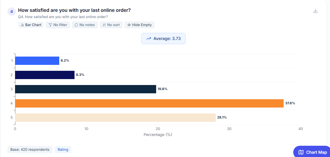
The full distribution behind the score - not just the single summary number.
Doing This in Opionate
The two techniques that matter most here have a direct home in the product rather than requiring a separate workflow. The "what's the main reason for your score" follow-up is a normal open-ended question sitting right after your rating question, and once responses come in, Text Analytics is built for exactly the job of turning a pile of those free-text reasons into a set of counted, reportable categories instead of something you read one at a time. And because the score itself is a standard question, breaking promoters, passives, and detractors down by tier, tenure, or any other field is the same cross-tabulation covered in our cross-tab guide - built into the same dashboard your NPS chart already lives in, not a separate export.
For the broader methodology behind turning any metric - NPS included - into a defensible, actionable finding, see Beyond Averages: The Professional's Guide to Survey Analysis.