
A dashboard full of rating scales and multiple-choice breakdowns can carry a survey a long way without ever answering the one question a reader usually asks first: why. Satisfaction dropped three points - why? Enterprise accounts are less engaged than small-business ones - why? A quantitative chart is very good at telling a reader that something is true and comparatively poor at telling them why, and the "why" usually lives in the open-ended comments, classified into themes, sitting in a completely different report nobody opens during the meeting where the quantitative chart actually gets discussed. Bringing classified themes onto the same dashboard as the numbers they explain closes that gap directly.
Table of Contents
- Themes as a Chart, Not Just an Export
- Crossing Themes Against the Same Segments as Your Scores
- Placing Theme Widgets Next to the Score They Explain
- Filtering a Theme Breakdown to a Specific Slice
- A Worked Example
- FAQ
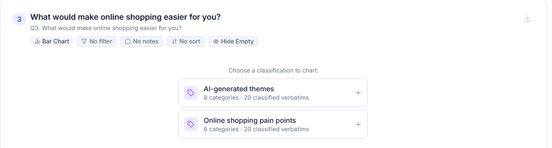
Adding a coded open-ended theme as a real chart, sitting alongside the rest of the dashboard.
Themes as a Chart, Not Just an Export
Once open-ended responses have been AI-classified into categories - see our guide on writing a good classification goal for how to get a clean category set to start from - that classification isn't limited to a CSV export sitting in a separate file. Classified categories can be added directly as a chart on the same dashboard as your quantitative widgets, the same way a multiple-choice question's breakdown would be, which means "what are the top themes in the negative comments" can sit as its own widget right next to the satisfaction score it's explaining, rather than being a separate analysis someone has to remember to go pull up.
Crossing Themes Against the Same Segments as Your Scores
The real value shows up once a theme breakdown is crossed against the same segments already used to slice the quantitative side of the dashboard. If a dashboard already breaks satisfaction down by plan tier, adding a theme breakdown filtered to just the lowest-scoring tier turns "enterprise satisfaction is lower" into "enterprise satisfaction is lower, and the classified comments from that segment are dominated by onboarding complaints" - a materially more useful finding, built from two pieces of the same dataset that too often live in entirely separate reports. This is the same underlying discipline covered in our guide on from themes to action - crossing categorized themes against the segments that matter - applied directly to how the dashboard itself gets structured, rather than treated as a one-off step in a separate written report.
Themes as a Separate Export
- A spreadsheet nobody opens unless they already suspect something
- Lives apart from the score it actually explains
- Easy to forget exists once the dashboard ships
Themes as a Dashboard Widget
- Sits right next to the score it explains
- Seen by the same person already looking at the number
- Filterable to the exact same segment as the score
Placing Theme Widgets Next to the Score They Explain
A theme breakdown chart placed on its own, disconnected page of a dashboard reads as a separate analysis rather than an explanation, even if the underlying data is drawn from the exact same survey. Positioning a theme widget directly beneath or beside the specific score it explains - a satisfaction trend line with the classified theme breakdown for the most recent wave's comments sitting immediately next to it - visually signals the connection between the two in a way that requires no extra explanation from whoever's presenting: a viewer's eye naturally reads adjacent widgets as related, and a scattered layout misses that free, built-in signal entirely.
Filtering a Theme Breakdown to a Specific Slice
A theme widget can be filtered the same way a quantitative widget can, which means a "why" breakdown doesn't have to cover your entire respondent base at once - it can be scoped specifically to detractors, to a particular segment, or to a specific wave, mirroring whatever quantitative widget it's meant to explain. This is worth doing deliberately rather than defaulting to an all-respondents theme breakdown for every widget: a theme chart scoped to just this quarter's detractors answers a sharper, more specific question ("why are the people currently unhappy unhappy") than the same chart run across your full, historically-accumulated comment set, which tends to blur a specific, current issue together with older, already-resolved ones.
A Worked Example
A subscription company's quarterly dashboard shows NPS trending down two points, with nothing in the surrounding quantitative widgets explaining why. The team adds a theme widget directly beneath the NPS trend line, classified from that quarter's detractor comments specifically and filtered to just the segment showing the sharpest decline - customers on the mid-tier plan. The theme breakdown shows a new category, "recent price increase," accounting for over a third of that segment's negative comments - a category that didn't exist in previous quarters' classifications at meaningful volume. Presented together, the trend line and the theme widget beneath it tell a complete, self-contained story in a single view: the score moved, here's the segment it moved in, and here's what that segment is actually saying about it - a finding the quantitative dashboard alone, without the adjacent theme widget, would have raised as a question rather than answered as a finding.
FAQ
Do I need to build the classification separately before it can go on a dashboard?
Yes - the open-ended responses need to be classified first, using the same process covered in our Introduction to Text Analytics guide, before the resulting categories can be added as a dashboard chart.
Can a theme widget be cross-tabbed the same way a quantitative widget can?
Yes - classified categories can be crossed against the same demographic or segment fields used elsewhere on the dashboard, the same underlying cross-tab mechanism covered in our guide on pre-built filtered widgets.
Should every quantitative widget have a matching theme widget next to it?
Not necessarily - reserve this for the scores where "why" is actually the live, open question, usually a metric that moved unexpectedly or a segment performing notably differently from the rest. Pairing every single widget with a theme breakdown risks the same widget-overload problem covered in our guide on anticipating follow-up questions.
What if the theme classification changes between waves - does the dashboard update automatically?
A theme widget reflects whatever classification it's built from, so if you re-run or refine a classification (see our guide on catching AI miscategorization), it's worth checking the connected dashboard widgets to confirm they're still pointed at the version you intend to present.
For the classification workflow this depends on, see Introduction to Text Analytics and From Themes to Action: Turning AI-Categorized Feedback Into a Report People Trust.