
"The product is great but support has been slow to respond" is one response and, honestly, two findings. A single-label classification has to pick one - forcing the whole response into either a positive-product category or a negative-support category, discarding whichever half didn't make the cut. A multi-label classification can tag it as both, which is more faithful to what the respondent actually said, and which comes with its own wrinkle: once a response can belong to more than one category, your category percentages stop summing to 100%, and reading the results the way you'd read a single-label breakdown will lead you astray.
Table of Contents
- What the Choice Actually Changes
- When Single-Label Is the Right Call
- When Multi-Label Is the Right Call
- Reading Multi-Label Results Correctly
- A Worked Example
- FAQ
Single-Label
One category per response - forces a choice, even on a genuinely mixed answer.
Multi-Label
A response can belong to several categories at once - closer to how people actually write.
What the Choice Actually Changes
Single-label classification sorts every response into exactly one category, full stop - even a response that genuinely spans two themes gets assigned to whichever one the classification judges to be the dominant or best-fitting match. This produces clean, mutually exclusive percentages that sum to 100% and chart easily as a simple pie or bar breakdown, at the cost of quietly discarding the secondary theme in any response that touched more than one.
Multi-label classification allows a response to be tagged with as many categories as genuinely apply, which preserves more of what a mixed response is actually saying, at the cost of a results table where the percentages no longer sum to a clean 100% - the same "why do these percentages add up to more than 100%" situation covered in our guide on reading multiple-choice results, just applied to AI-classified open text instead of a select-all-that-apply question. Neither approach is more "correct" in the abstract; they're answering slightly different questions, and the right choice depends on how mixed your actual response data tends to be and what you're planning to do with the output.
When Single-Label Is the Right Call
Single-label classification is the better fit when responses in your dataset are mostly clean and single-themed to begin with - a lot of open-ended business feedback genuinely is, especially for narrowly scoped questions ("what's the main reason you're canceling?") that push respondents toward naming one primary factor rather than several. It's also the easier choice when the output is headed for a simple, executive-level chart where a clean, summable breakdown matters more than capturing every nuance - a single pie chart showing cancellation reasons is more digestible in a five-minute readout than a multi-label breakdown that needs an accompanying explanation of why the numbers don't sum to 100%. If you're not sure how mixed your data actually is, reviewing a random sample of twenty or thirty responses by hand before deciding is a quick, worthwhile check - if very few of them genuinely touch more than one theme, single-label is probably the simpler, sufficient choice.
When Multi-Label Is the Right Call
Multi-label classification earns its added complexity when a meaningful share of your responses genuinely span more than one theme, and forcing a single label would mean regularly discarding real signal. Open-ended questions that invite a broader, less constrained answer - "tell us about your experience," "any other feedback" - tend to produce more naturally mixed responses than narrowly scoped questions, since respondents aren't being pushed toward naming just one thing. It's also the right choice whenever the secondary theme in a mixed response is itself something you plan to act on - if "great product, slow support" responses are common, and support responsiveness is a genuine area of investment, losing that signal to a forced single-label pick would mean under-counting a theme that actually matters to the business, not just under-describing individual responses.
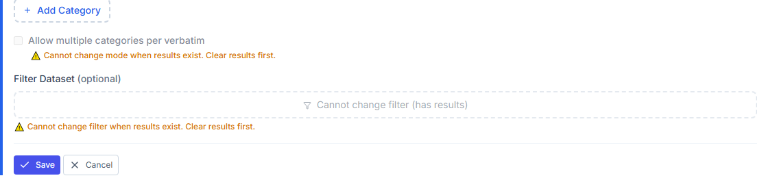
Turning on multi-category classification - percentages across categories will sum past 100%, by design.
Reading Multi-Label Results Correctly
The core discipline for reading multi-label results is the same one that applies to any select-all-that-apply data: a percentage represents the share of responses that included that category, not the share for which it was the single defining theme, and the percentages are expected to sum to more than 100% in proportion to how often responses carried more than one label. Reporting "34% of responses mentioned support issues" is accurate and useful; reporting it as though it means "support is the single most common complaint, ahead of everything else" overstates what a multi-label percentage is actually claiming, especially if a category with a lower percentage is more often the sole label on a response - a distinction worth checking directly if it matters to your finding, since a category that shows up often but always alongside something else is a different, weaker kind of signal than one that shows up less often but almost always alone. Dividing the sum of all category percentages by 100% also gives you the average number of labels per response, a genuinely useful number for understanding how mixed your dataset actually is at a glance.
A Worked Example
A SaaS company classifies 400 renewal-survey comments using a multi-label setup across five categories: pricing, product quality, support, onboarding, and competitor mention. The raw percentages sum to 148%, meaning the average response carries just under one and a half labels. Support and pricing are the two largest categories individually, at 38% and 34% - but a closer look shows a meaningful difference in how each shows up: pricing is the sole label on 61% of the responses that mention it, while support is the sole label on only 22% of the responses that mention it, appearing alongside another category (usually product quality, praised in the same breath as a support complaint) the rest of the time. The team reads this correctly as two different findings: pricing is a standalone concern worth addressing directly, while support complaints are more often a secondary friction point riding alongside an otherwise positive response - a distinction that shapes two different, appropriately-scoped responses rather than treating both categories as equivalent just because their headline percentages are close.
FAQ
Can I switch from single-label to multi-label partway through a tracked survey?
You can, but treat it as a break in comparability - a shift like this changes what your reported percentages mean, similar to any other change in the measurement itself. Our guide on tracking a metric over time covers handling changes like this without corrupting a trend line.
Does multi-label classification cost more or take longer to run?
It generally doesn't add meaningful cost or time to the classification step itself - the added complexity is entirely in how you report and interpret the output afterward, not in generating it.
How do I know if my data is mixed enough to justify multi-label?
Read a random sample of twenty to thirty responses by hand and count how many genuinely touch more than one theme. If it's a small minority, single-label is probably sufficient; if it's common, multi-label will capture meaningfully more signal.
Should I always check whether a category is usually a response's sole label or usually paired with others?
It's worth checking for your top few categories at least, especially before making a resourcing decision based on their percentages - a category that's almost always paired with another carries a different kind of signal than one that consistently stands alone.
For the full classification workflow, see Introduction to Text Analytics and Reading Multiple-Choice Survey Results Without Getting Fooled.